Tag Archives: Abstract Painting

Interview at “Savvy Painter”

Savvy Painter

* * *
I’m pleased to announce that Antrese Wood, host of the invaluable podcast Savvy Painter, has posted a conversation we had a while back about the vagaries of representation, abstraction and other pictorial concerns. I hope you give it a listen!

“Recent Paintings” at The Ohio State University at Lima

Sunny Day Hotsy Totsy.jpgMario Naves, Sunny Day Hotsy Totsy (2015), acrylic on panel, 16″ x 20″; courtesy Elizabeth Harris Gallery, NY

* * *

I’m pleased to announce an upcoming solo exhibition at The Farmer Family Gallery in Reed Hall at The Ohio State University at Lima. The show will include sixteen paintings created between 2014-2015. The opening takes place on Thursday, January 21, between 4:30-6:30 p.m. The exhibition continues until February 19.

Sunny and Expansive: The Art of Stanley Whitney

Stanley Whitney #1

Stanley Whitney, Dance the Orange (2013), oil on linen, 48″ x 48″; courtesy The Studio Museum in Harlem

* * *

The following review was originally published in the April 5, 2005 edition of The New York Observer and is posted here on the occasion of “Stanley Whitney: Dance the Orange”, an exhibition currently on display at The Studio Museum in Harlem.

The press release accompanying an exhibition of paintings by Stanley Whitney, on view at Esso Gallery in Chelsea, contains a lengthy excerpt from an essay by one Teresio Ottavio Camenzio. He describes Mr. Whitney’s abstractions thus: “Painting, from within the picture.”

This turn of phrase suggests that painting is a process within which the artist immerses himself. Mr. Camenzio goes on to relate that for Mr. Whitney, putting brush to canvas “reveal[s] his wishes differently from how he expected.” Surprise, then, is an integral component of Mr. Whitney’s art.

That an artist is a medium for forces beyond his control is a sentimental notion, but that’s not to say it can’t be true. Works of art–the good ones, anyway–share a startling inevitability, the sense that they sprung, fully formed, from the materials in which they were shaped. How many artists are willing to abdicate their egos to such a self-abnegating endeavor?

Mr. Whitney does, though not as much as one would like. Each of his squarish canvases is a brick-like accumulation of color separated by a series of horizontal striations. The paintings expand toward the center with a series of large rectangles aligned roughly along the midpoint of the canvas. These are topped off by a similar but smaller array of forms; a row of two horizontal rectangles is tucked underneath. All of it is fitted within the parameters of the canvas, like cardboard boxes inside a storage cabinet.

Stanley Whitney #2

Installation shot of “Dance The Orange” at The Studio Museum in Harlem; courtesy Arts Summary; A Visual Journal/photo by Adam Reich

* * *

This standardized armature admits to discrepancies in scale, shape and rhythm–but just barely and begrudgingly. Unable to relinquish a reliance on all-over uniformity, Mr. Whitney’s attitude toward composition–the considered and balanced arrangement of dissimilar forms–is neither casual nor rigorous: it’s disregarded. The recurring superstructure, however much it may be tweaked here and there, isn’t an organic element of the work’s shaping; it’s an imposition that stifles the paintings. Flexibility is called for. The artist could ease up on the controls.

Then again, Mr. Whitney probably depends on paint-handling and color to enliven the regulated compositions. To his credit, he almost gets away with it. Possessed of a distinctive touch–offhand, a little cloddish, scruffy but never sloppy–Mr. Whitney is loath to overstate his case and, as such, discloses a modest and amiable nature. The variegated palette brimming with chalky purples, sharp yellows and bright aquamarines (to name just three hues) is, in its warmth and bumptiousness, of a piece. The layered surfaces and glowing tones would suggest the influence of Mark Rothko, though Mr. Whitney doesn’t partake of existentialist romance; color, for him, is a conduit to joy. The pictures are sunny in the best sense of the word.

The finest of them has been corralled into the back gallery, presumably because of its size (large) and its character: It’s the only picture that strays from the signature format. Admittedly, introducing an extra row of color may not seem like a big deal, but in an art of circumscribed form, an extra bit of not much can mean quite a lot–in this case, a more expansive sense of ease. In the end, you’ll thank Mr. Whitney for pointing out just how pleasurable pure color can be.

© 2005 Mario Naves

Reconsiderations: Wassily Kandinsky

Vassily-Kandinsky

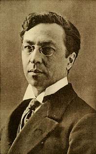
Wassily Kandinsky, circa 1913

* * *

The following essay originally appeared in the December 2009 edition of The New Criterion.

The Russian painter Wassily Kandinsky (1866–1944) occupies a pioneering role in the modernist canon. He was among a handful of artists who first ventured into abstraction. Pure abstraction, that is: Picasso and Braque, while delving into the headier precincts of Synthetic Cubism, had already made pictures with relationships to observed phenomena that were, if not exactly strained, then tenuous. But it was left to figures like Kandinsky to jettison representation altogether. Given the skepticism with which abstraction was greeted at the time, such a pursuit betokened sensibilities made bold (or reckless) by their aesthetic convictions.

Kandinsky’s radical achievement is the subject of a sweeping retrospective at the Solomon R. Guggenheim Museum.  Kandinsky is, among other things, a reminder that retrospectives don’t always shine a generous light on their subjects.  What’s striking about the six signature abstractions installed toward the exhibition’s beginning isn’t their sophistication, but the manner in which that sophistication was misprised. In arrays of wiry lines, random puffs of color, and pinched, convulsive rhythms, the paintings struggle against their own pretensions.

The paintings exude a certain fervor, but not the kind that emanates from exquisitely honed compositions. Kandinsky was an adherent of Theosophy, a mish-mosh of mystical bromides made influential by Madame Blavatsky, the self-proclaimed practitioner of levitation, clairvoyance, and other sideshow hijinks. It was Kandinsky’s artistic goal to evoke this immateriality prized by Theosophists. The Dutch painter Piet Mondrian, another follower of the hermetical Madame, wrote that if an artist is “to approach the spiritual … [he] will make as little use as possible of reality, because reality is opposed to the spiritual.” Escaping the tangible world was the Theosophical artist’s highest calling.

800px-Wassily_Kandinsky,_Improvisation_27,_Garden_of_Love_II,_1912._Exhibited_at_the_1913_Armory_Show
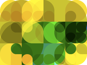
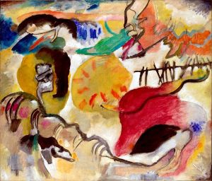
Wassily Kandinsky, Improvisation 27 (Garden of Love II) (1912), oil on canvas, 47-3/8″ x 55-1/4″; courtesy The Metropolitan Museum of Art

* * *

As Kandinsky writes in Concerning the Spiritual in Art (1911):

“A painter, who finds no satisfaction in mere representation, however artistic, in his longing to express his inner life, cannot but envy the ease with which music, the most non-material of the arts today, achieves this end. He naturally seeks to apply the methods of music to his own art. And from this results that modern desire for rhythm in painting, for mathematical, abstract construction, for repeated notes of color, for setting color in motion.

“This borrowing of method by one art from another, can only be truly successful when the application of the borrowed methods is not superficial but fundamental. One art must learn first how another uses its methods, so that the methods may afterwards be applied to the borrower’s art from the beginning, and suitably. The artist must not forget that in him lies the power of true application of every method, but that that power must be developed.

In manipulation of form music can achieve results which are beyond the reach of painting. On the other hand, painting is ahead of music in several particulars. Music, for example, has at its disposal duration of time; while painting can present to the spectator the whole content of its message at one moment.”

Oil paint, in its fleshy malleability, is intensely material, and paintings are physical objects with an adamant stake in the here and now. How did abstraction enable painters to navigate the conundrums posed by Theosophy? In The Triumph of Modernism, Hilton Kramer divines the crucial role Theosophy played in the development of Kandinsky’s vision. Kramer writes of how, “in the realm of art at least, a silly idea may sometimes form the basis of a serious accomplishment”:

“Theosophy supplied a systematic cosmology to which the new abstract art could readily attach itself. For the pioneers of abstraction were as eager to have their art ‘represent’ something—even, in some special sense, to have it represent ‘nature’—as the most academic realist, and theosophy gave them a meaningful world beyond the reach of appearances to ‘represent’ in a new way. Thus, abstraction can be said to have made its historic debut as an esoteric form of representational art. Art for art’s sake had nothing to do with the advent of abstraction. It was a means to an end.”

Comprised of close to one hundred paintings and over sixty works on paper, “Kandinsky” will likely define his achievement for the next few generations—or, at least, until the Guggenheim feels it necessary to re-celebrate the artist who is its sine qua non. Originally known as The Museum of Non-Objective Painting, the Guggenheim was founded on the spiritualist aspirations exemplified by Kandinsky’s paintings. Solomon R. Guggenheim collected over one hundred and fifty of them on the advice of his friend, the painter and connoisseur Hilla Rebay. As the museum’s first director, Rebay underscored Kandinsky’s predominance by devoting permanent galleries to the work. The curators of “Kandinsky” have keyed into the special relationship between artist and institution—it’s right there to deduce from the show’s smart selective pacing, nuance, and range.

moscow-i-1916.jpg!Blog

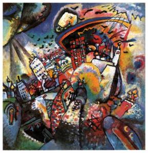
Wassily Kandinsky, Moscow I (1916), oil on canvas, 59.5 x 49.5 cm.; courtesy The State Tretyakov Gallery, Moscow

* * *

Kandinsky began painting at the age of thirty. A student of law, economics, and statistics at the University of Moscow, he was on track for a life in academia,when inspiration or, rather, inspirations struck. Attending a performance of Wagner’s Lohengrin and seeing Monet’s Haystack paintings in 1896 confirmed Kandinsky’s artistic longings, but it was a Moscow sunset that put him over the top. Marveling at “the garish green of the grass, the deeper tremolo of the trees, the singing snow with its thousand voices or the allegretto of the bare branches, the red, stiff silent ring of the Kremlin walls,” the disaffected law student concluded: “To paint this hour, I thought, must be for an artist the most impossible, the greatest joy.” Kandinsky did, in fact, paint an almost literal transcription of this euphoric scenario twenty years later in Moscow I (1916).

Kandinsky’s turn to abstraction is set out with clear, inevitable logic. The exhibition begins with Colorful Life (1907), a storybook vista whose Byzantine composition and clusters of jewel-like color recall, respectively, Art Nouveau and Hinterglas Bilder, a form of folk painting done on glass. Kandinsky brought the same palette, albeit applied in larger swatches, to the landscapes and fairy tale fragments featuring princes, horses, and castles he painted upon moving to Germany in 1908. The saturated colors, flurries of brushstrokes, and increasingly roughhewn structures typical of the work done in Munich and Murnau are textbook examples of Expressionism, the highly charged style developed and propounded by Der Blaue Reiter, an artists’ group founded by Kandinsky, Franz Marc, Alexei von Jawlensky, and other notables.

improvisation-19-1911.jpg!Blog

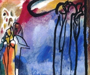
Wassily Kandinsky, Improvisation 19 (1911), oil on canvas, 120 x 141.5 cm.; courtesy Stadtische Galerie im Lebenbachhaus, Munich, Germany

* * *

Kandinsky veered away from recognizable imagery around 1911. Forms become less defined and concrete; space is rendered kaleidoscopic, turbulent, and bottomless. Kandinsky’s symbols can be relatively clear-cut: the elegant couple out for a stroll with their dog in Impression VI (Sunday) or the towering onlookers in Improvisation 19 (both 1911). At other times, a loping collection of black lines and color patches suggests, rather than delineates, a galloping horse or a mountain range. Two years later, not even a subtitle—Moscow, say—can codify a turbulent expanse of pictorial incident. Experience had been denatured into pure sensation. The “spiritual in art” had been realized.

But at what cost? Abstraction is now a stylistic trope in a culture overrun with them; its revolutionary character resides largely in period documentation. It is difficult, at this date, to appreciate the risk inherent in Kandinsky’s art. But risky it was: Consider his enemies. Though Kandinsky achieved positions of pre-eminence in the cultural bureaucracies of Communist Russia—he had returned to his homeland in 1914—Kandinsky was eventually pegged as “bourgeois” and fired on charges of being “an emigrant.” Returning to Germany, he found his pictures lumped under the Nazis’ “degenerate” rubric. Kandinsky’s art was anathema to the twentieth century’s two most pernicious political regimes. Abstraction was a dicey pursuit.

Outside of their historical context, however, Kandinsky’s paintings lose power. Essentially drawings embellished with arbitrary rushes of color, Kandinsky’s iconic abstractions scrabble for a uniformity that’s never forthcoming. Shapes and rhythms, lines and brushstrokes scrunch toward the center of each composition and fizzle toward its edges. A veritable rainbow is spread over the surfaces with staccato insistence, but it doesn’t amplify or generate much in the way of spatial complexity or intrigue. And forget about light: With rare exceptions—the Guggenheim’s Black Lines (1913) is a sparkling case in point—Kandinsky’s variegated palette resulted in musty hodgepodges of pigment.

Ausstellung "Entartete Kunst" im Galeriegebäude am Münchener Hofgarten (Eröffnung am 19. Juli 1937).
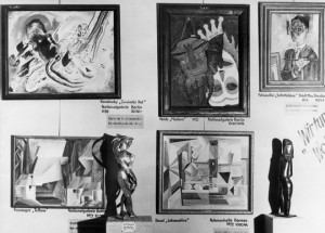
Kandinsky painting seen at top left in the Degenerate Art exhibition in 1937

* * *

During his sojourn in Russia, Kandinsky came under the influence of Constructivism; as a consequence, his jangled conglomerations of line, symbol, and geometry began to tighten and focus. Expressionism gave way to something controlled in its process if not in its ultimate effect. By the time he returned to Germany in 1922 for a teaching stint at the Bauhaus, Kandinsky’s approach was, by and large, commensurate with the school’s rigorous aesthetic. Contours became finite, surfaces uninflected, forms were rendered punchy and graphic—the paintings exhibit the influence of his friend and colleague Paul Klee. Unlike the Swiss master, Kandinsky couldn’t reconcile (or pressurize) his iconography within the picture’s frame. The picture plane was merely a container of images, rather than a vital participant in their realization.

Kandinsky’s lack of concern with a format’s perimeters poses less of a problem in the works on paper. Ensconced in one of the museum’s tower galleries, Kandinsky’s watercolor and India ink pieces are the most engaging incarnations of his vision. In them, Kandinsky’s totemic diagrams are at home; the small scale renders his otherworldly portentousness modest, notational, and approachable. Plumes of sprayed color—usually a dusky haze of rust-brown—are predominant and provide a unifying environment wherein Kandinsky’s emblems can convincingly teeter, totter, and, in the ethereal Into the Dark (1928), ascend with grave purpose.

The final ramp of the Guggenheim is devoted to the work Kandinsky created in Nazi-occupied France, where he resided in the final years of his life. The paintings done in Paris are ornamental inventories of Surrealist-inspired motifs. With their candied pastels and Miró-like blips and blobs—the Spaniard was a close friend—the pictures are delightfully scattershot in demeanor and clean in resolution. The best of them, Succession (1935), trots out an array of biomorphic forms and does so without apology. It’s as if Kandinsky, freed from the challenges of invention, was having fun for the first time in his life. The free-floating whimsy of Around the Circle (1940) and Various Actions (1941) are winning enough that you can forgive their cornball hieroglyphics and irresolute compositions.

47.1159_ph_web

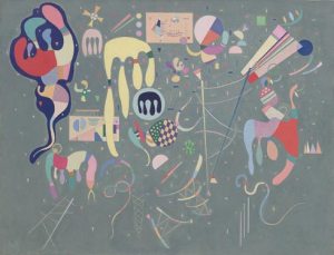
Wassily Kandinsky, Various Actions (1941), oil on canvas, 35-1/8″ x 45-3/4″; courtesy The Solomon R. Guggenheim Museum

* * *

All the same, the Surrealist impulse in Kandinsky’s late work is curiously anemic—vivifying maybe but, ultimately, insignificant. Of the French paintings, Kramer astutely notes that they were “not a conversion to Surrealism, but a struggle to move into the orbit of Surrealist freedom.” Kandinsky’s biomorphs are singularly devoid of any existential correlative. The impulse to poetic fantasy is strongly and repeatedly expressed, but it seems to lack any real roots in the artist’s experience. In the end, Kandinsky’s concept of the “spiritual” was too bloodless perhaps, too metaphysical and otherworldly, to permit him to become the kind of erotic poet he saw triumphantly at work in Miró. We are given the design of an imaginary universe, but not the thing itself.

“Without a specific and profound spiritual content,” Kramer goes on to say, “Kandinsky felt, abstract painting would simply decline into decorative trivialities.”

One cannot dismiss Kandinsky’s achievement as “trivial,” but there is an abiding sense upon leaving the Guggenheim that his ambitions far outstripped their realization—or, instead, his ambitions muddled their realization. Kandinsky was too much in thrall to the tenets of Theosophy to transcend his own evangelical willfulness or, in the later paintings, to come out from underneath them to play. Mondrian may have been sold on Madame Blavatsky’s blather as well, but his oeuvre is rooted in the prerequisites of the studio, not in woozy hocus-pocus. The same cannot be said of Wassily Kandinsky.

© 2009 Mario Naves

A Welcoming Impurity: Contemporary Abstract Painting

LaCalleAbraham LaCalle, Saracine 4 (2003), oil on linen, 65 x 50 cm.; courtesy Galería Manuel Ojeda

* * *

The following review was originally published in the February 9, 2004 edition of The New York Observer and is posted here on the occasion of Reinventing Abstraction, an exhibition curated by Raphael Rubenstein at Cheim & Read (until August 30).

This is a good time for abstract painting.

(The loud thwack you just heard is the sound of abstract painters all over the city smacking their foreheads in disbelief: What is he talking about?)

Take a look at what dominates the scene: big-budget installations, obscurantist videos, interminable performances, conceptualist novelties, anti-art hi-jinks and photographs by photographers who don’t know how to focus their cameras. The best-known contemporary painter at the moment is a figurative artist: John Currin.

Painting itself is not having an easy time of it: Though news of its death has become a joke even to those who pine for the day, many artists continue to view painting as a plaything to be mocked rather than its own independent pleasure. Try putting brush to canvas with sincerity, passion or ambition and you’ll be shown the door and given large-type directions to the nearest pasture.

JaffeShirley Jaffe, Swinging (2012), oil on canvas, 130 x 97 cm.; courtesy Galeria Nathalie Obadia

* * *

As for abstraction, it’s no longer the engine of culture or the culmination of Modernism; it’s now a specialist’s pursuit. The minimized status that abstraction was given in the millennial exhibitions mounted by MoMA only ratified current opinion: Abstraction is just there, another byway of artistic pursuit in the anything-goes bazaar of the contemporary scene.

So what’s good about all that?

Out from under the burden of historical necessity and away from the limelight of successful innovation, abstraction is free. Having been marginalized by Pop, politics, fashion and theory, abstraction has retrenched and set off on pathways that might once have been thought inappropriate, untenable or ridiculous. The quest for “the final painting”–a goal once considered the hallmark of Modernism–degraded the form into a feeble simulacrum of itself. (Just stroll through the gallery at Dia:Beacon devoted to the austere pseudo-paintings of Robert Ryman; you might as well be visiting a tomb.)

Purity, having been achieved, was not the apogee of painting, but a dead end masquerading as artistic truth. Having seen how much could be taken out of a painting and still leave a painting (or something like it), many contemporary painters want to discover how much you can put back into a painting and still have an abstraction. In fact, the best abstract painters working today are a rather impure lot. Inclusiveness is their watchword: They’re willing to try anything once, maybe even twice. They take the whole of human experience as their inspiration.

USleJuan Uslé, MIRON (2006-07), vinyl, dispersion and dry pigment on canvas, 12″ x 18″; courtesy Cheim & Read

* * *

This inclusive approach is not brand-new. Robert Delaunay, Arthur Dove, Stuart Davis and Piet (“Boogie-Woogie”) Mondrian all invited the world into their abstractions, and the results were salutary. The list of today’s abstract artists who favor a welcoming impurity includes Thomas Nozkowski, Shirley Jaffe, Laurie Fendrich, Bill Jensen, Ross Neher, Juan Usle, Andrew Masullo, Harriet Korman and Pat Adams. Their efforts constitute a healthy, if unheralded, artistic moment.

And now we can add Abraham Lacalle to the list. Mr. Lacalle is a youngish Spanish painter (he’s in his early 40′s and hails from Madrid) who’s having his first one-person show in New York, at Marlborough Chelsea. Knowing that inspiration is various and eternal, Mr. Lacalle looks for it everywhere. The paintings are mix-and-match accumulations of pattern and geometry and, less so, color and representation. He makes a brusque patchwork of cross-hatching, dots, stripes, lozenge-like forms, doodles and drips, as well as cacti, hats, fish and hands.

JensenBill Jensen, Images of a Floating World (Passare) (2009), oil on linen, 26″ x 20″; courtesy Cheim & Read

* * *

The juggling of pictorial motifs is reminiscent of any number of contemporary painters who promiscuously lift and juxtapose motifs from history’s warehouse of style. But no one will mistake what Mr. Lacalle does for appropriation. Like the proverbial child in a candy store, Mr. Lacalle surveys 20th-century art (particularly, though not exclusively, Cubism) and likes what he sees. His enthusiasm is infectious.

The paintings, with their distinctly Spanish palette of scrubby ochres and grays, revel in disjunction. Mr. Lacalle’s touch, unencumbered and endearingly clumsy, evens the temper of the fragmented compositions. The bigger canvases are overcomplicated machines; their size and ambition can’t disguise a certain flimsiness or a bent toward formula. The less-cluttered smaller pictures are playful and loose; a minor key suits Mr. Lacalle’s informality. Particularly smart are Sarasine 4 (2003) and Sarasine 6 (2003), both of which neatly mark the distinction between sophistication and amateurishness. At the moment, Mr. Lacalle is less a fully formed painter than a precocious talent; his best work lies ahead of him. Still, you’ll be happy to make his acquaintance.

© 2004 Mario Naves

A Painter in Need of a Spanking: Andrew Masullo

2

Andrew Masullo, 5378 (2011-2012), oil on canvas, 24″ x 20″; courtesy Mary Boone Gallery and Feature, Inc.

* * *

The following review was originally published in the July 12, 2004 edition of The New York Observer and is posted here on the occasion of Andrew Masullo at Mary Boone Gallery, Chelsea (until April 27).

There are artists we hate to love and artists we love to hate. Most artists don’t make a dent; nonentities rarely do. Then there are artists in need of a spanking: painters and sculptors of talent, skill and vision incapable of resisting their worst impulses. Chief on the list for corporal punishment is Andrew Masullo, whose recent paintings are at Joan T. Washburn Gallery.

Mr. Masullo partakes of a distinctly American brand of abstraction, a tradition that mines high modernist style for individualistic–that is to say, independent and eccentric–purposes. The pictures are lovingly delineated and kitsch-inflected amalgamations of organic shape and geometric pattern. Taking inspiration from the paintings of Alice Trumbull Mason, Myron Stout and Thomas Nozkowski, Mr. Masullo is as singular, rigorous and uncompromising as his predecessors. He can nip and tuck a composition with the best of them. That doesn’t prevent him from indulging in groan-inducing cutesy-pie tactics.

3Andrew Masullo, 5369 (2011), oil on canvas, 20″ x 24″; courtesy Mary Boone Gallery and Feature, Inc.

* * *

In one canvas, he appends cartoony hands and arms onto an array of floating rectangles; in another, an iconic black circle, Malevich-like in its portent, is transformed into a Christmas ornament. All the while, his oversweetened palette makes our teeth ache. Mr. Masullo is clearly capable of standing outside of style in order to ridicule it, yet his mockery is amiable, even at times a bit dreamy. The sensibility is acidic, not malevolent–Mr. Masullo only hurts the ones he loves. Sacrificing gravity for cheap caprice, his aesthetic is rooted in the quirks of personality. Nihilism has nothing to do with it.

How willing you are to forgive Mr. Masullo the kiddie biomorphism and insouciance depends on one’s taste. Me, I enjoy his sharp wit, applaud his pictorial steadfastness and consider the excess of paintings–over 30!–a token of generosity. Not that we should be grateful for everything that runneth out of Mr. Masullo’s cup; too many of the pictures are flighty or hermetic. When he does pull one off–as in 4067 , with its spic-and-span array of stripes, or the cut-rate psychedelia of 4066 (both 2003)–you realize Mr. Masullo is a precocious nuisance you’re willing to put up with.

© 2004 Mario Naves

Cherry-picking from the Archives

Tine Lundsfryd, Pause (2007-2008), acrylic, chalk, pencil, color pencil and oil on canvas, 64″ x 73″; courtesy Lori Bookstein Fine Art

* * *

The following review appeared in the October 18, 2004 edition of The New York Observer and is posted here on the occasion of Tine Lundsfryd’s current exhibition at Lori Bookstein Fine Art (September 15-October 15, 2011).

A good portion of the paintings in Tine Lundsfryd’s first one-person exhibition at Lori Bookstein Fine Art have been sold. This is, I think, a heartening sign. Not that the extent to which an artist sells work is a gauge of its merit: If we’re to believe the red dots surfeiting the price lists regularly seen on the front desk at Mary Boone Gallery, there’s no shortage of collectors who are soon parted from their money.

What distinguishes Ms. Lundsfryd’s sales is that they seem to indicate an audience hungry for serious abstract painting, an audience willing to put its money where its eye is. Ms. Lundsfryd’s geometric paintings are slow- burning, quietly ambitious and self-effacing. They are the antithesis of the chilly, quick-fix sensationalism dominating the scene. The pleasures—and challenges—that Ms. Lundsfryd proffers aren’t commensurate with a culture infatuated with technology, celebrity and mass media.

Seen in that light, you might be tempted to peg her as an anomaly or a throwback. The truth is, she has bigger fish to fry. Viewing art as a continuum that spans the centuries, she partakes of influences as diverse as Zurbarán, John Cage, the quilters of Gee’s Bend and, I would argue, the painters decorating the caves at Altamira. For what thrives in Ms. Lundsfryd’s art is the notion—and, in fact, the reality—that marks on a flat surface can take on a magical independence.

Working off a grid delineated in pencil, she creates an all-over faceting, a network of color and space. Rectangles, diamonds and triangles coalesce into crystalline fields that recall game boards, the cosmos and, skittering through the slow accumulations of pattern, the landscape. Subtle shifts in rhythm, value, scale and touch make for compositions that pulse, flow, evolve and shimmer. There’s something meditative about the gentle and tenacious way that Ms. Lundsfryd applies oil to canvas—something skeptical, too.

That the pictures embody contradictory impulses without straining attests to Ms. Lundsfryd’s ability to endow limited form with manifold meaning. 

“It’s hard to believe that somebody has the nerve to use this language again” is how a flabbergasted writer for Vogue recently described Ms. Lundsfryd’s approach to “true abstraction.” Nerve has nothing to do with it—conviction does. That it is conjoined with a tough and tensile painterly gift makes Ms. Lundsfryd’s debut a salutary alternative to the distractions that pass for art in our time.

© 2004 Mario Naves

Juan Uslé at Cheim & Read

Detail ImageJuan Uslé, I’m Home (2010), vinyl, dispersion and dry pigment on canvas, 24″ x 18″; courtesy Cheim & Read

* * *

There’s never been a Juan Uslé show that I haven’t liked and there’s never been a Juan Uslé show that hasn’t proved frustrating.

Like Hans Hofmann, albeit nowhere near as epochal and considerably more blasé, Uslé is a good painter who paints few good paintings. The appeal of the work–its “goodness”, I guess–is the play-it-as-it-lays, from-the-ground-up process. Given the relative inflexibility of his materials, Usle’s improvisational layering of silky patterns, errant doodles and oddments of color either hits the mark or de-evolves into congested jumbles of painterly incident.

The latter is usually the case and rarely without interest, but I’m Home (2010) does the trick. Looking at the painting–it’s featured in Uslé’s current show at Cheim & Read–you know why the artist stayed his hand:  within economically, almost insouciantly stated means, the image achieves an uncanny, oddball rightness. It proves that the near-misses hanging nearby are less blunders than steps on a journey worth traveling.

© 2011 Mario Naves

Malevich and The American Legacy at Gagosian Gallery

Kazimir Malevich, Painterly Realism of a Football Player–Color Masses in the 4th Dimension (1915), oil on canvas, 27-1/2 x 17-3/8″; courtesy Gagosian Gallery

* * *

The history of Modernism is inconceivable without the art of Kazimir Malevich (1878-1935), but was it necessarily enriched by it? Malevich’s role in establishing abstraction as a viable form of artistic expression is indisputable. His goal was to create pictures that embodied “the end and beginning where sensations are uncovered, where art emerges ‘as such.’” This pursuit led to radically distilled images, most famously in White on White (1935), wherein a veering rectangle is virtually indistinguishable from the surrounding space. It was within austere arrangements of geometry that humankind, Malevich felt, would transcend the material world and achieve “the supremacy of pure feeling.”

Malevich and The American Legacy, an exhibition at the uptown branch of Gagosian Gallery, is centered on six canvases by the self-described “zero of form.” Organized in collaboration with the artist’s heirs and with significant museum loans, American Legacy sets out to explore “aesthetic, conceptual, and spiritual correspondences” between the pioneering Russian abstractionist and a raft of American artists, among them, Mark Rothko, Barnett Newman, Ellsworth Kelly, Frank Stella, Ed Ruscha, Brice Marden and Agnes Martin.

Donald Judd wrote that “the paintings Malevich began painting in 1915 are the first instances of form and color”—which means, I’m guessing, that we should consider them the first examples of pure abstraction in Western painting. (Form and color have, after all, been around since our ancestors daubed fauna on the cave wall.) The centerpiece of American Legacy is Malevich’s Painterly Realism of a Football Player—Color Masses in the 4th Dimension (1915). Given the title allusion, how pure could Malevich’s art be?

Never mind: The Gagosian show cruises on straight lines, grids and squares—lots of squares. They can be seen bopping through Robert Ryman’s surprisingly tensile series of paintings on aluminum, Richard Serra’s Brutalist prop sculpture and John Baldessari’s Violent Space Series: Two Stars Making a Point but Blocked by a Plane (for Malevich) (1976), a typically laconic iteration of Dadaist montage. In and amongst an impressively appointed array of machine-tooled artworks, Cy Twombly’s scribbled homage to “Malevitch” [sic] comes as a relief.

Malevich’s Suprematism (as the style came to be known) was fueled in equal parts by Cubism, Christian iconography and, not least, the advent of the Communist state. The lesson Americans gleaned from Malevich—the Americans featured at Gagosian, anyway—is that tying puritanical form to aesthetic absolutism all but guarantees high-flown, worry-free decoration.

Suprematism, in other words, made the world safe for Minimalism, Conceptualism and any other art too refined to stimulate interest. As such, The American Legacy is an exhibition of blue-chip dead ends. It traces, with exquisite resolve and deadening certainty, the route from revolutionary foment to the academy of the marketplace.

© 2011 Mario Naves

Originally published in the March 22, 2011 edition of City Arts.


Give One Million Monkeys One Million Brushes and in One Million Years You’d Get . . . Las Meninas?

Featured image

* * *

A message from the good people at WordPress appeared in my mailbox the other day, enumerating the year-end statistics for this blog.  Accompanying it was the above abstraction, a digital rendition of this site’s “crunchy numbers” as made by a “helper monkey”. Handsome, don’t you think?  Puts me in mind of the underrated painter Frederick Hammersley (1919-2009).

Frederick Hammersley, Up Within (1957-58), oil on canvas, 48″ x 36″; courtesy The Pomona College Museum of Art

* * *

But then there’s the monkey thing.  Though I’m not averse to the folksy parlance affected by certain corporations, the implication, however facetious, that a monkey could do something like the Hammersley made my thin-skin bristle. Despite what we (ahem) sophisticated types might believe, non-representational art continues to be held in suspicion by a majority of the planet, up to and including segments of that rareified sphere known as “the art world”.

In other words, some variation of “My kid could do that” applies. The charge is easy to pooh-pooh, but a degree of chagrin is elicited all the same. As an abstract artist with reservations about the medium’s scope and efficacy–read Randall Jarrell’s damning (and brilliant) essay, “Against Abstract Expressionism” to sow your own seeds of doubt–I don’t entirely dismiss such complaints.  I mean, how likely is it that the following credit would appear in one’s e-mail box?

Unknown Simian of Extraordinary Pictorial Acumen, A Gaggle of Privileged Humans And Their Domesticated Wolf (2010), oil on canvas, size–who cares?; courtesy The Museum of Cornpone Afflicted Blog Providers

* * *

I’m forcing the issue.  But clearly WordPress’s “helper monkey” knew a thing or two about picture making–about chromatic transparencies, extracting compositional variety from unified elements, rhythm, space and light.  Best to give that person some credit.  The rest of us monkeys need all the help we can get.

Postscript:  The Jarrell essay can be found in this superlative compilation of critical essays.  It’s well worth chasing down at your local antiquarian bookstore.

© 2011 Mario Naves